Our client came to us ready to update their logo. In looking at it, we realized it didn’t convey what they actually did or help them stand out from their competitors.
Our Solution
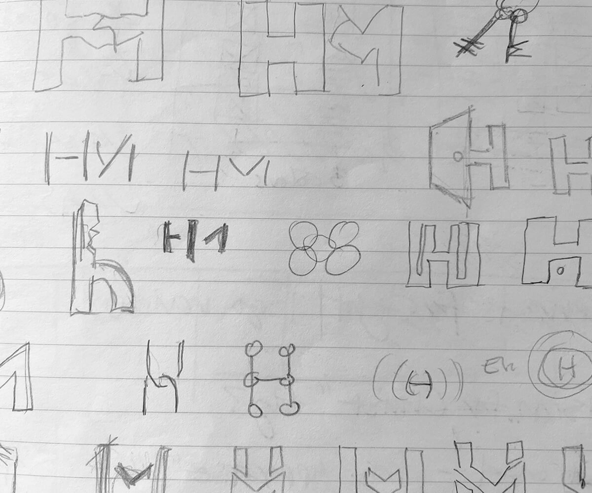
We explored the obvious icons that depict mortgage companies: keys, houses, etc. But we wanted it a bit more personal and clever. After several sketches and iterations, we realized the “H” and “door” combination would marry nicely and give us the mark we were after.
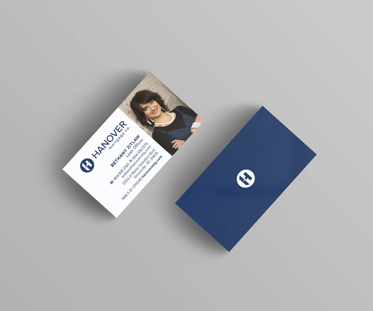
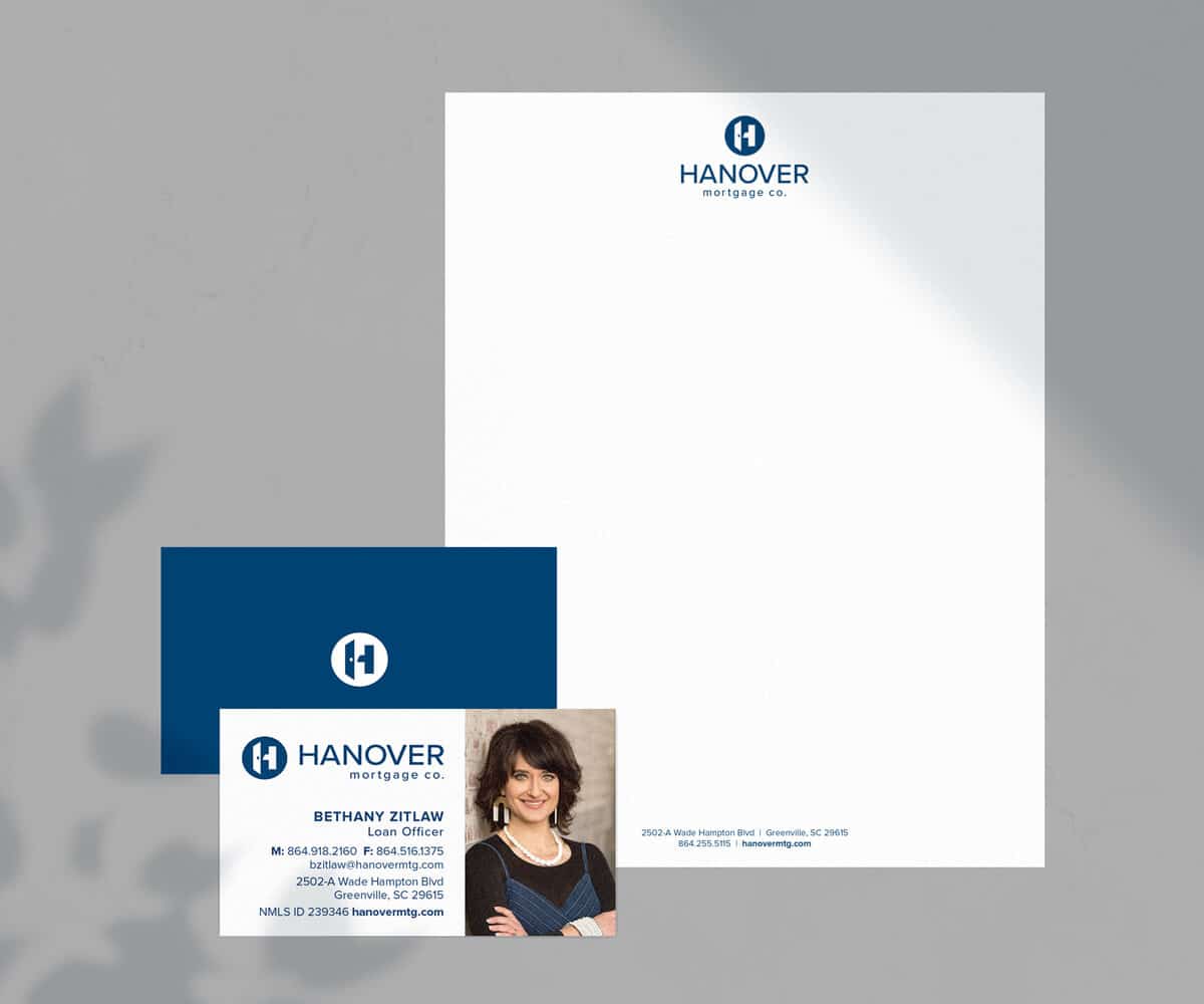
Services Provided
Branding, Business Card Design, Logo Design
Stop losing valuable
customers to confusion
Connect with them through a clear, consistent message and design.