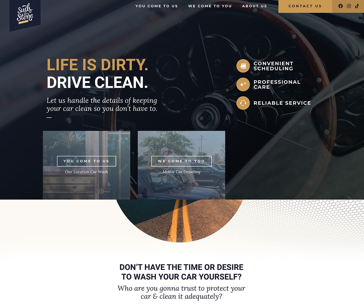
You deserve a website that shows people how your products or services help solve their problems, which will in turn generate leads for your business.
Our guide will help you craft the perfect message that will get results.
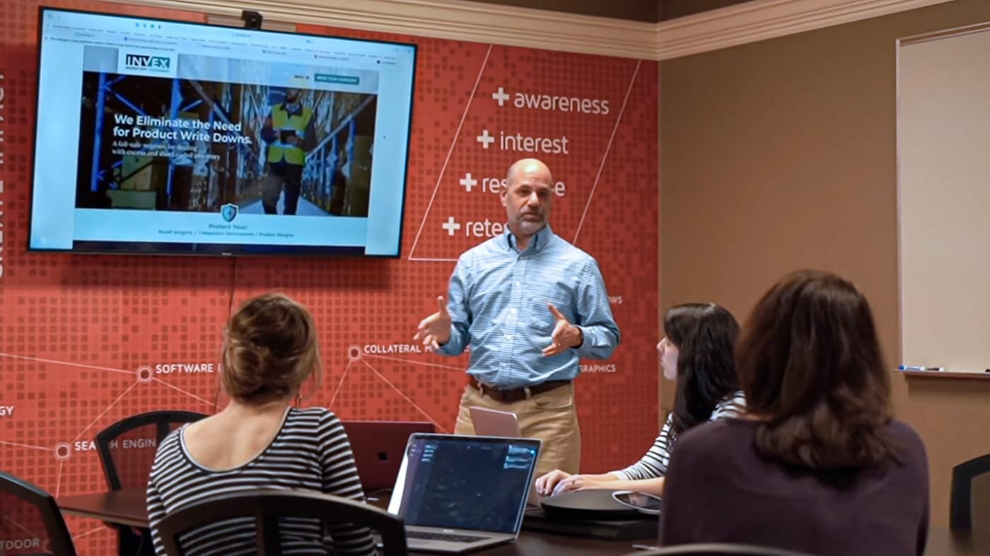
Our designers are constantly creating based on industry design trends.
It’s more than just building a website. We can build a strategy to get you found.
We will respond to your needs the same day or within 24 hours.
We’ve helped large and small brands succeed for over 15 years.
Let’s hop on a video call to discover your website’s current pain points: What’s working? What’s totally busted?
We will collaborate on a plan to create inspiring copy, beautiful design & a robust website that works great on any device.
Have peace of mind and confidence in your website that connects with your customers.
Here’s a variety of additional services to help you drum up even more business.
which is why we built an experienced team around our proven process that will meet your goals and give your visitors a better first impression with your website.
Mon – Fri | 8am – 5pm