Too many businesses waste time and money on websites that aren’t attracting customers. Having a “nice-looking” website isn’t the same as having one that actually works for your business. Your website should be a 24/7 sales machine. If you want your site to work for you, you must make it simple, clear, and focused on what your customers want.
5 Steps to Creating a High-Converting Website
1. Start with a Clear Message
Messaging is the most important aspect of your website, starting with your header. If your header is vague or unclear, visitors will leave.
Your visitors need answers fast, and clarity wins every time.
When they land on your site, they should immediately know three things:
- What you offer
- How it improves their lives
- What step do they need to take first
Use plain language that is easy to understand. Your header should pass the “grunt test.” Could a caveman figure out these three things at a glance? If so, you’re on the right track.
“I get bike. I go fast. I buy now.”
Clear messaging eliminates confusion and builds trust, ensuring visitors stay on your site longer and are more likely to convert into customers.
2. Address The Problems
People visit your website to solve a problem. Do you understand your customers’ needs and problems?
If your content directly addresses their problems, you’ll quickly trigger their buying impulse. Whether it’s poor eyesight, sleepless nights, or unreliable service, positioning your products and services as the solution will immediately increase your perceived value. And when your value increases, so do your sales.
3. Make Buying Simple
One of the biggest mistakes we see on websites is making it too difficult for customers to take the next step. A strong, clear call to action (CTA) should be front and center, at the top of the page, and repeated throughout the site. Make it clear what they need to do next to get what you’re offering.
Make sure your CTA buttons are clear, direct, and easy to find, like “Buy Now,” “Book A Call”, or “Find A Dealer.” These should be in a standout color and repeated throughout the site. Avoid weak CTAs like “Learn More,” which don’t encourage visitors to take action.
Think of your CTA buttons as strategically placed cash registers. Make it easy for your customers to act when they’re ready by placing buttons where your visitor will likely say, “Yes!” (Psst… that means everywhere). CTAs should be prominent, repeated, and visually aligned with your brand.
Remove any obstacles that may get in the way of a sale. From creating easy navigation paths to strategically placed call-to-action buttons, your website can transform into a sales machine when you eliminate barriers to buying.
4. Grab New Leads
You’ve probably heard the expression, “It’s not goodbye; it’s just see you later.” That’s what your website should say to every visitor who is ready to leave. It’s not enough to get people to your website – you need a way to stay top-of-mind.
One of the best ways to do this is by offering something of value for free in exchange for an email address. Whether it’s a free e-book, a special report, or exclusive access to content, your lead generator has to be seen as valuable. It can’t just be “sign up for our monthly newsletter.” Sorry, your newsletter may be fabulous, but it offers zero value to your website’s viewers. The perceived psychological value of an email address is worth between $10-$20. Is what you’re offering worth that amount of money?
Once you have that email address, you can stay in front of potential customers for 6, 12, or even 24 weeks, nurturing them until they’re ready to make a purchase. They might bounce off your website within minutes, but if you can regularly get in their inbox, you’re at the top of their mind when they finally decide, “I’m going to do it.”
5. Set A Clear, Simple Plan
Confusion is one of the main reasons viewers don’t convert to customers. They see you can solve their problem but aren’t sure how the process works or what to expect. A simple three-step plan can make all the difference.
Breaking things down into three manageable steps removes uncertainty and makes the buying process easy. Customers can stop wondering about the “how” and move toward the “yes.”
Here’s what this could look like on your website:
- Schedule a Consultation – Easy, no pressure.
- Get a Customized Solution – Tailored specifically to your needs.
- Enjoy the Results – It’s that simple.
People want to anticipate the next step. Give your customers a step-by-step plan to move them forward. If you don’t, they are more likely to fail to take the next action.
Lift the Fog for Your Customers
Your customers don’t care about your logo or fancy graphics—they don’t even really care about YOU. They care about finding a solution to their problem. The clearer your website communicates to people what you offer, how to make their lives better, and what they need to do to get what you’re offering, the more money your website will make.
No one will follow you into a fog of confusion. If you confuse, you lose.
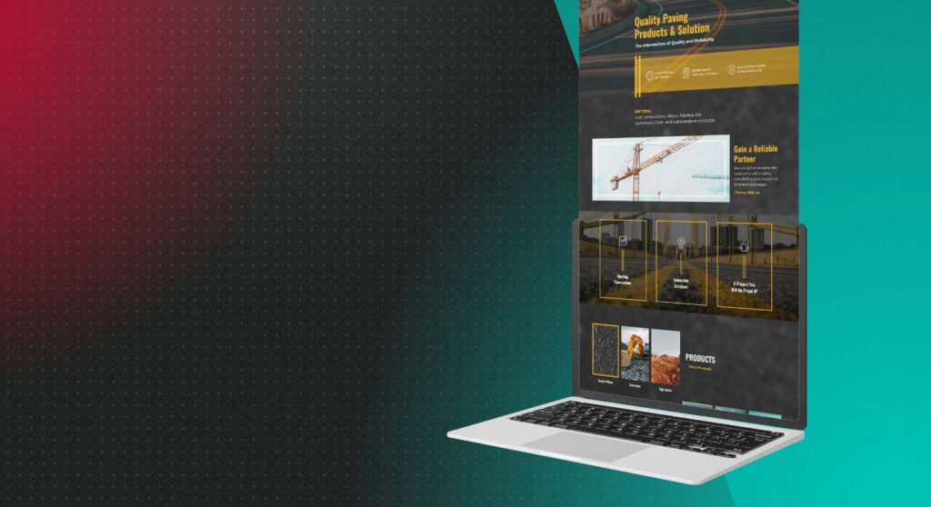
By implementing these five simple steps, you can transform your website into a high-converting sales tool. At Drum Creative, we craft websites that combine beautiful design, smart functionality, and a proven messaging framework. If you’re ready to drum up more business, book a call now to discuss building a website that will bring you more loyal customers.