Sherman College of Chiropractic

white browser bar

Before

white browser bar

After

The Problem

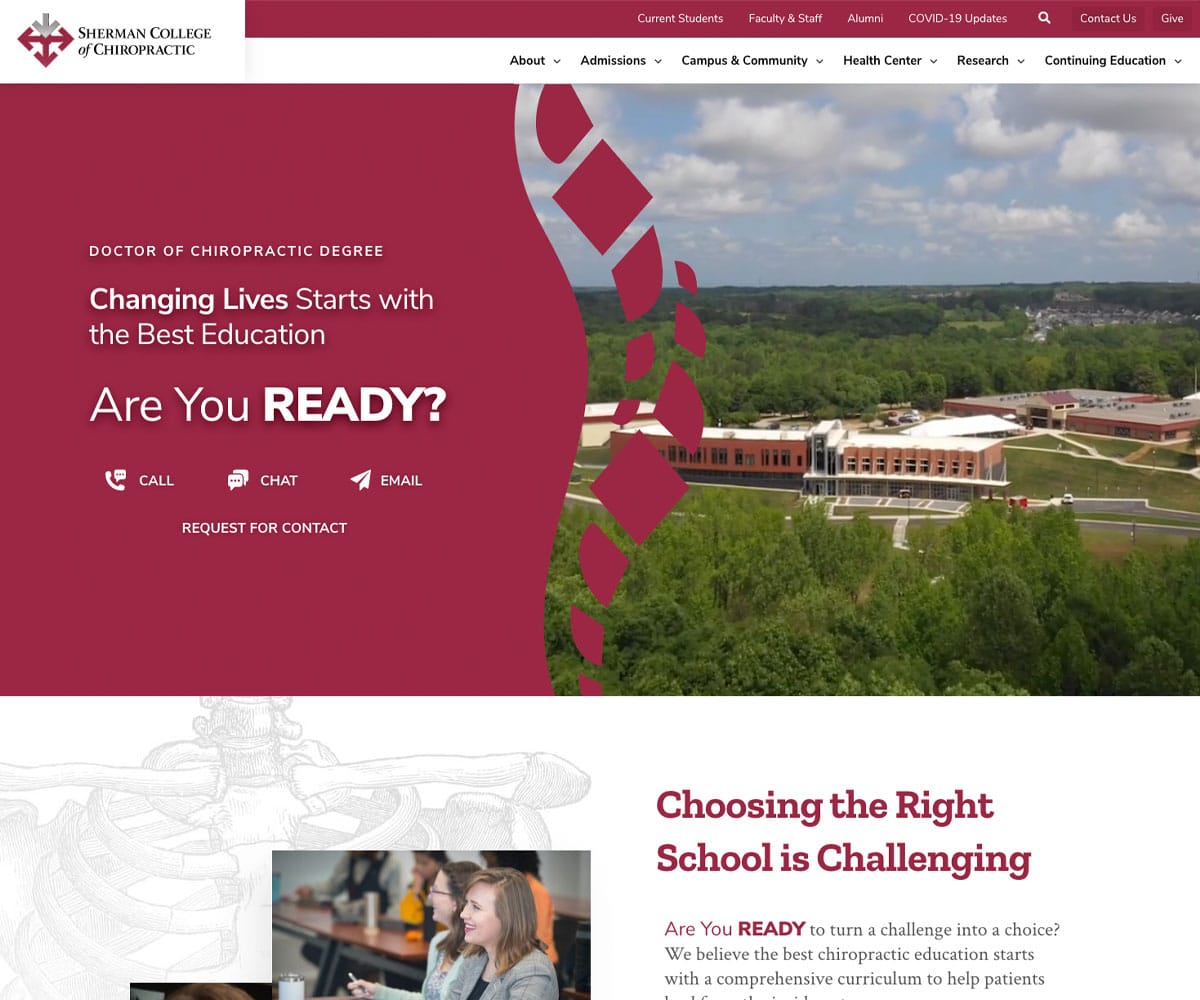
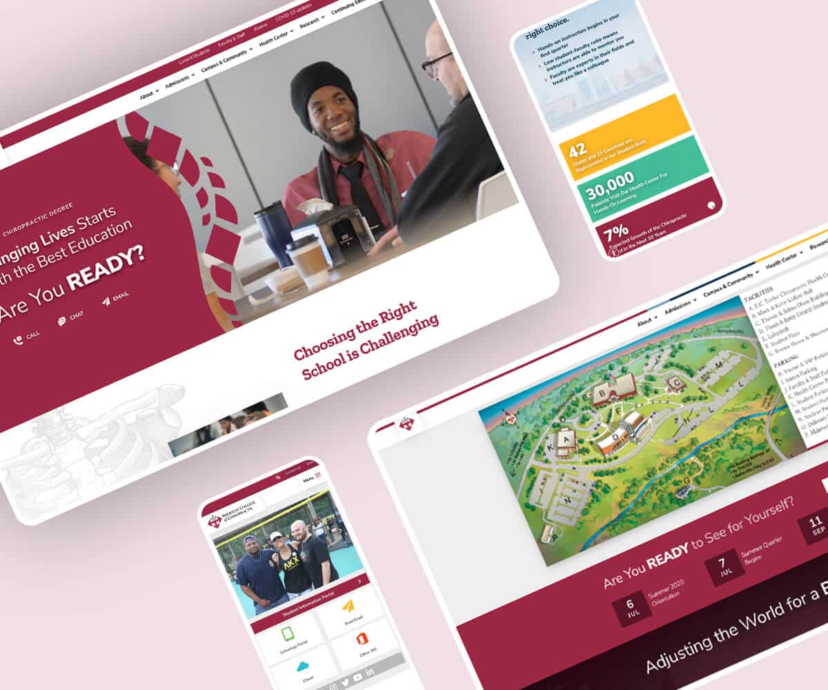
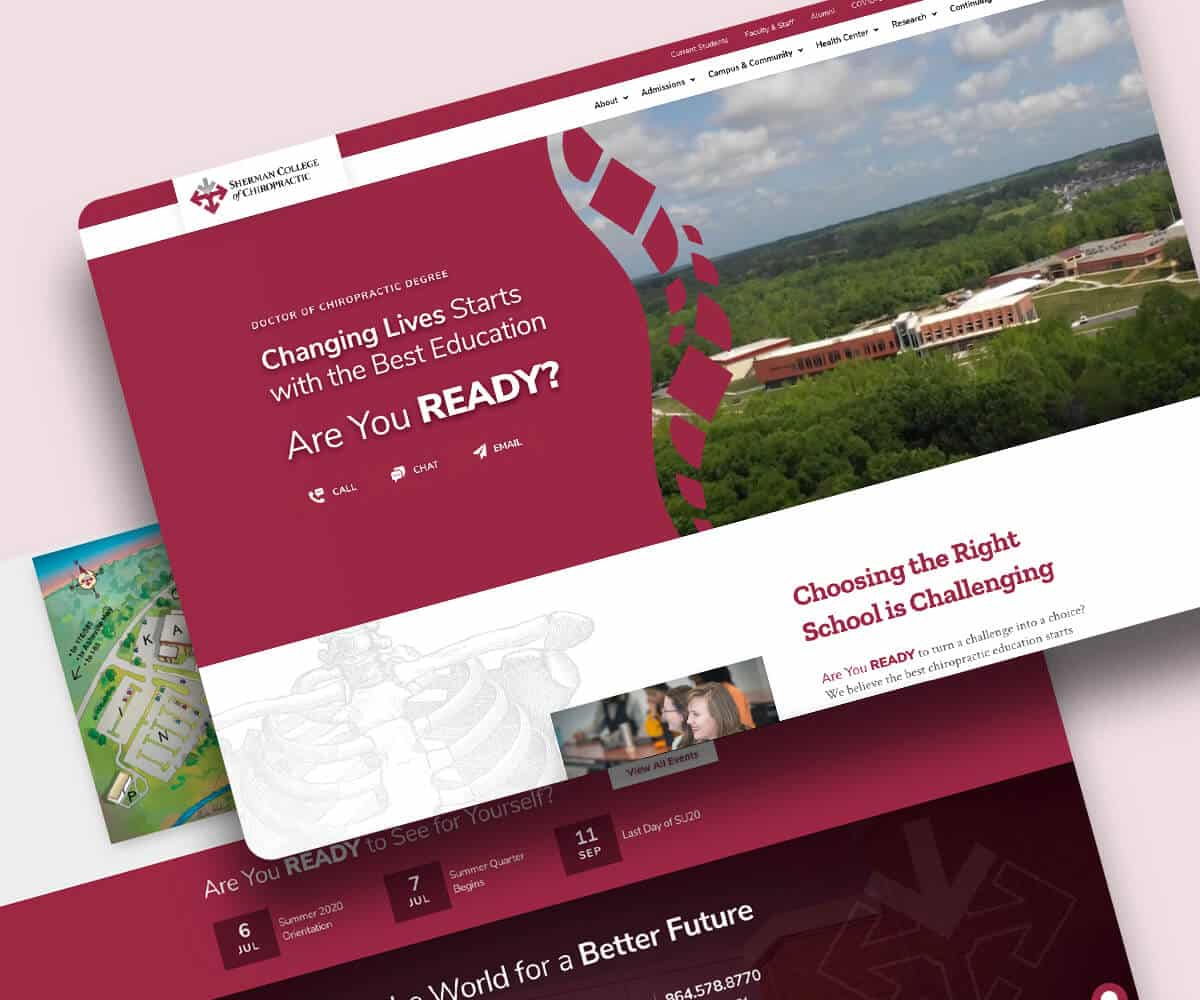
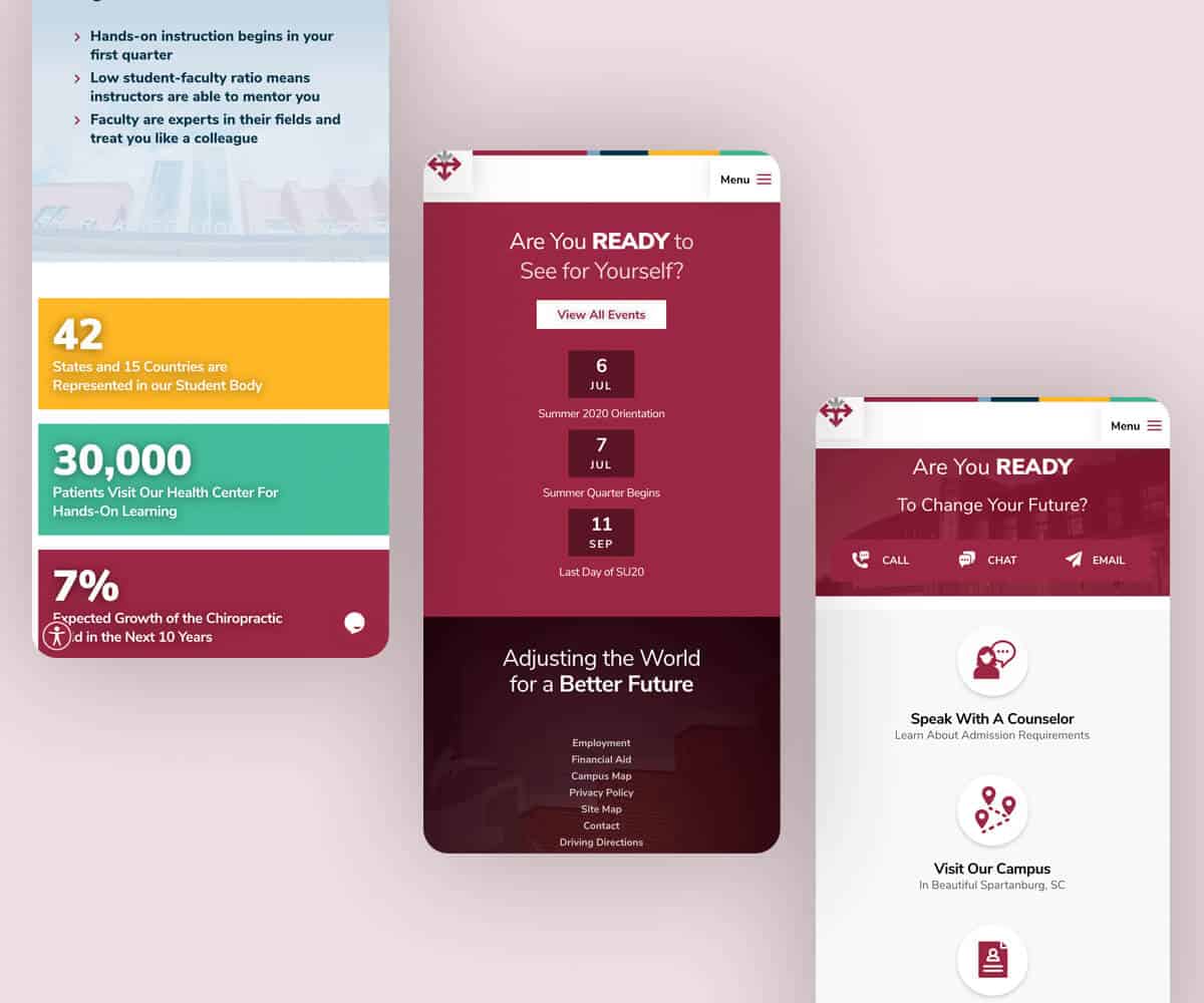
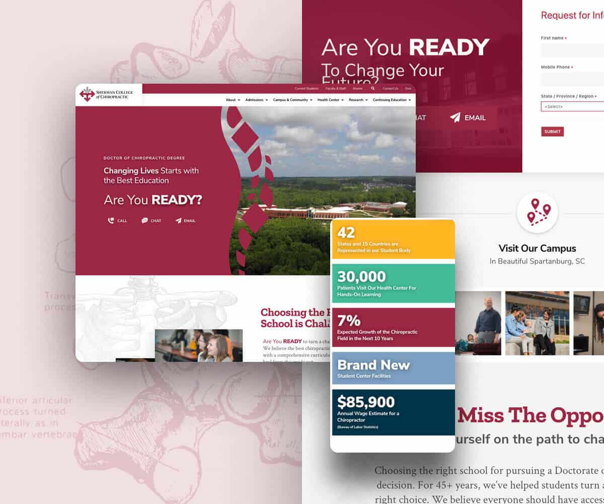
The challenge of this project was to rework nearly 100 pages into a newly designed website that improved the user’s experience and reflected their modernized and newly renovated campus (on a tight deadline). It was important to Sherman to provide simple and direct navigation for their many different viewers, including current and potential students, faculty and staff, alumni, doctors and people in the community and anyone interested in chiropractic medicine.

Our Solution

Working together with Sherman’s IT, Marketing, Admissions, and Institutional Advancement Departments we guided them through the Story Brand framework to help clarify that message into an elevator pitch, and then convert that message into a simple wireframes for their main landing pages that displayed the order and flow of the message. After crafting their brand’s message for the homepage, our team was able to develop a beautiful, modern and clean design that is reflective of Sherman.

We achieved this look through custom animations and complex code to easily search and filter events, FAQs; job listings; directories; and PDF resources eliminating the need for multiple plugins that caused the site to be slow and inefficient. Now, visitors have a more impactful experience on the web that captures the look and feel of the Sherman campus and community.

Services Provided

Stop wasting money on a fancy web design that doesn’t work.

Build a website that stands out from your competition