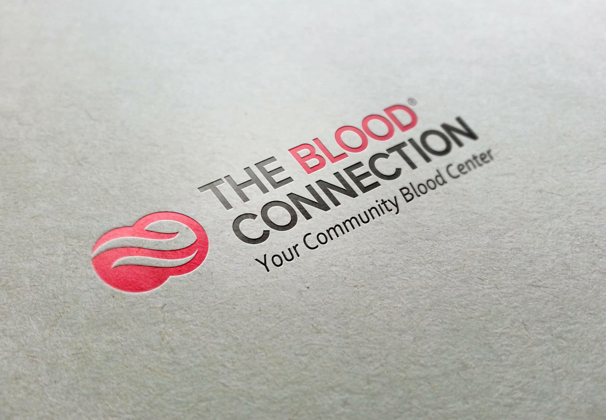
The Blood Connection had been a client of ours for awhile. They came to us wanting a logo refresh, and were also open to a redesign. We agreed, and also proposed the idea of pulling the graphic mark out of their name.
Our Solution
After pulling several designers and our intern, we immersed ourselves into this project and had a lot of fun. We explored many different redesigns and tweaks. In the end, we all agreed that a clean, modern update on the two blood cells was the correct way to go.
Services Provided
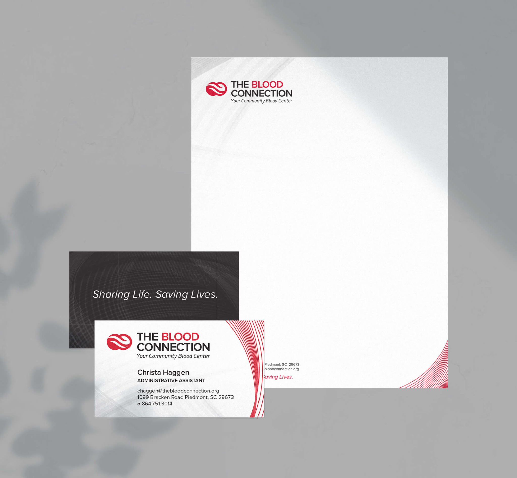
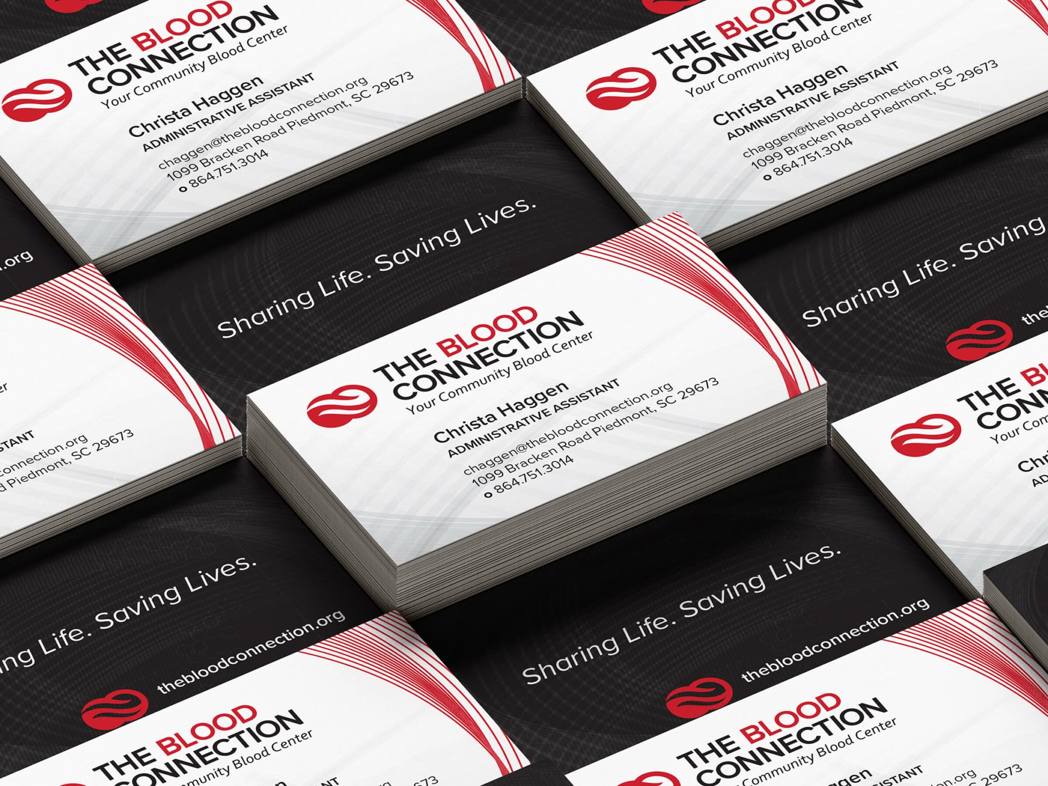
Branding, Brochures, Business Card Design, Christmas Animation Video, Graphic Design, Logo Design, Magazine Ad, Shirt Design, Stationary Design, Web Design
Stop losing valuable
customers to confusion
Connect with them through a clear, consistent message and design.